Supporting prospects with a transparent free trial experience
Clarifying the benefits and limitations of Okta’s free trial to help prospects set up and use their trial over 30 days.
The challenge
A Pendo survey revealed that 47% of prospects signing up for the Workforce free trial were small businesses, with under 50 people. The sales team didn’t support these customers because they didn’t meet the minimum deal size.
These potential customers stuggled after sign up to understand their free trial and set it up. Constraints weren’t easily discoverable; prospects would turn to sites like Reddit to ask how many active users they could include in their trial.
The goal
Update the in-product free trial experience to create a transparent, intuitive user experience so small businesses, and all prospects, could set up, try, and eventually purchase Okta products without sales or support help.
Getting to work
As the only content designer working across the Workforce platform and its design system, I was brought this project by its product designer. She asked: How can we ensure content meets the goal?
We reviewed the current state together. After sign up on Okta.com (owned by the growth team), the experience threw prospects right into a list of set-up tasks.
There was no clear explanation of what was included for their use, or what was excluded. Prospects were left to discover limitations by trial and error.
Over the course of the trial there was also only a small banner reminding them of their days remaining. It could be easy to miss if they received any other notifications.
Click each image to enlarge.

Focusing on clarity and transparency
We agreed we needed to focus on clarity and transparency. The trial is possibly the prospect’s first experience as an Okta customer and they should be supported like a customer. To give prospects the information they needed, where they needed it, and when they needed it in-product — we needed additional content. The designer took my initial questions back to the team for feedback and approval:
Can we clarify what products are or aren’t included in the free trial?
What are the other major limitations or pain points?
How can we help prospects prepare to take the next step?
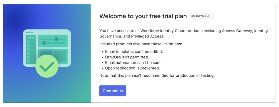
When the team clarified what products are excluded, and what can’t be configured in a trial account, we got to work on how to include this information. To introduce the trial to prospects, the designer built an explanatory modal to accommodate flexible text. She also included the design system’s status component to highlight the date more effectively.
I wrote versions of the banner to keep prospects informed at important points during the trial:
Day 1: Explain what’s excluded and other limitations
While this is more negative then I’d prefer to be, this focus on exclusions and limitations allowed greater clarity. Prospects wouldn’t waste time trying to implement a feature that isn’t included.
I considered the positive alternative of focusing on the products and features that are included. Since these are much more comprehensive, I’d need to feature some products over others. This would require leadership and team approvals and data to determine which and why. This wasn’t available within the timeframe, so we designed the best possible customer experience.
Day 5: Introduce what will happen at the end of their trial
The current experience only notifies prospects when they have five days remaining in their trial. Nara and the team had feedback that five days doesn’t give enough time to prepare for next steps: whether moving forward with purchase or needing more time.
I wrote new content to explain what features they would lose after day 30 and encourage them to begin considering a paid plan.
Day 25: Warning prospects that their trial is ending
With only five days left, the status becomes a warning. In this scenario, I left the copy the same — no last minute new information for prospects, just a more urgent reminder.
Nara and I hypothesized that users likely wouldn’t visit the Getting started page as frequently. The other trial components and product-triggered emails could also warn prospects so they’d have time to plan their next step and not lose access to any of their data.
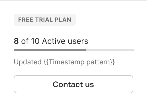
Adding personalized trial data
Additional prospect feedback indicated that they didn’t know how many users could be added or active in a trial. The number of users is crucial to testing the product, since authentication methods, permissions, and more can be assigned to individuals or groups. Prospects needed to be able to plan the status of users they’d import or create to successfully try the product. (There is an additional layer of complexity here that users can import or add more than 10 users but only 10 can be active at one time. This is explained in-depth when they import or add users.)
Nara designed a unique omnipresent modal to track active users and I worked within the design system team to have it approved as part of the unified primary navigation. (The navigation component was also being updated. So, this was great timing and an additional layer of coordination and complexity.)
Reaching the user limit while testing
Prospects also need to be notified of their active user limit while they are working in their trial organization. Depending on their task, they may need to deactivate some users to continue.
I wrote a modal to explain the immediate action they could take to unblock their work while also encouraging them to consider an enterprise plan.
Driving plan purchase
At every step in their trial, prospects are encouraged to contact us. This primary call to action creates a connection without focusing on “sales.” If and when prospects choose to take this action, a simple modal form opens.
Day 1-30: Extend trial or choose products
Prospects are given options to extend their trial or get sales support to choose products.
The option to extend a free trial is revealed here to measure prospect’s feedback. If the majority of them request an extension (15 days), the team will re-evaluate the length of the free trial and how this could affect sales cycles.
Day 30+: Change plans or choose products
If prospects don’t take action before their trial ends, their product access is locked.
In the past, all they would see in-product was a failed login. They would have to check their email to find a notification and take action.
We added a version of the simple form as a page. This allowed prospects to still take action in the product.
Supporting prospects outside of the product
The free trial experience is supported by product-triggered emails. An email is sent as part of sign-up: prospects need to activate their trial account, like all Okta users.
Day 1: Updating Welcome/Activation
In the previous experience, prospects received the same activation email as users on paid plans with one unique phrase added “to try Okta.”
Again, this wasn’t clear messaging focused on prospects. I wrote new email copy, from the subject line to details to clarify the trial experience for prospects.
Original
Click each image to enlarge.
Updated
Reminding prospects with new emails
We also created new emails to remind prospects about time limit of their trial. We hypothesized that if they weren’t yet daily users we should remind them earlier. I wrote an email to remind them with 7 days left to drive them into the product.
Day 23: New trial reminder email
Day 30+: Updated trial deactivated email
In the old experience, this was the second, and final email, prospects received. I updated the copy since we could offer them next steps.
The outcome
While individually, the added details that provide context and transparency seem minor, they cumulatively empower prospects with crucial information they need to trial Okta’s core products.
Product trial optimization continues, including unifying developer and Auth0 trial experiences with this experience.